One thing I obsessively focus on is test readability. The reason being that it’s often very hard to understand what a test is really about; usually the signal-to-noise ratio in tests is very low, and that makes it hard to understand what is being tested. So I continuously try to improve the readability of my tests by experimenting with different styles. Yesterday I was working with my colleague Sander, and we discovered yet another trick that I think can help: syntax highlighting.
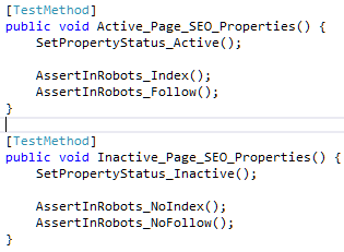
Consider this piece of code:

It tests for certain SEO properties (the contents of the robots meta tag in the HTML) based on the current status of the specific page.
Now, I think these tests already have a relatively high signal-to-noise ratio. The thing is at a pretty high level of abstraction, and you can probably follow what’s going on as non-technical person. It is, however, less clear what the difference are between these two tests. In fact, only 8 characters are different, out of a total 312 characters. It’s really hard to spot what those differences are when you start reading this code.
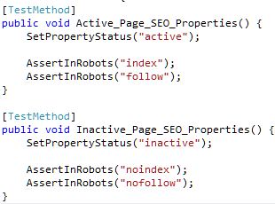
Now consider this form:

While the number of changed characters is exactly the same, I think both the original intent and the differences between the tests are way more clear. When I get back to this code, my eyes will immediately be drawn to the strings, which happen to also capture the essence of the tests, which is what we’re after.